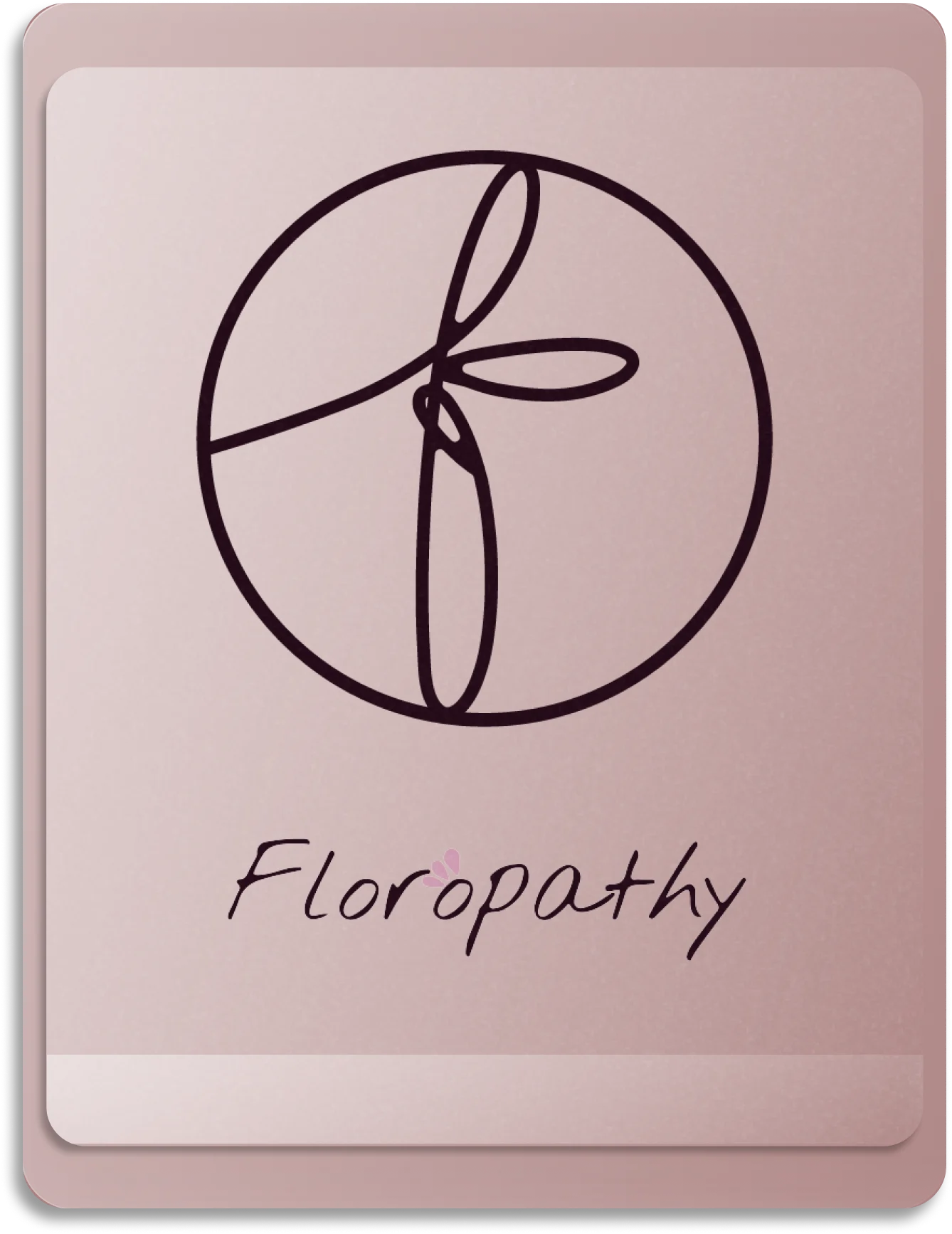


floropathy
Organic Skincare Brand Identity and Packaging Redesign

floropathy
Floropathy, an organic skincare brand from Australia, approached WellPal Creative with a unique challenge. They sought to redesign their female product line and consult on a brand identity restructuring that would accommodate future product and line extensions, such as men's, children's, and spa lines.
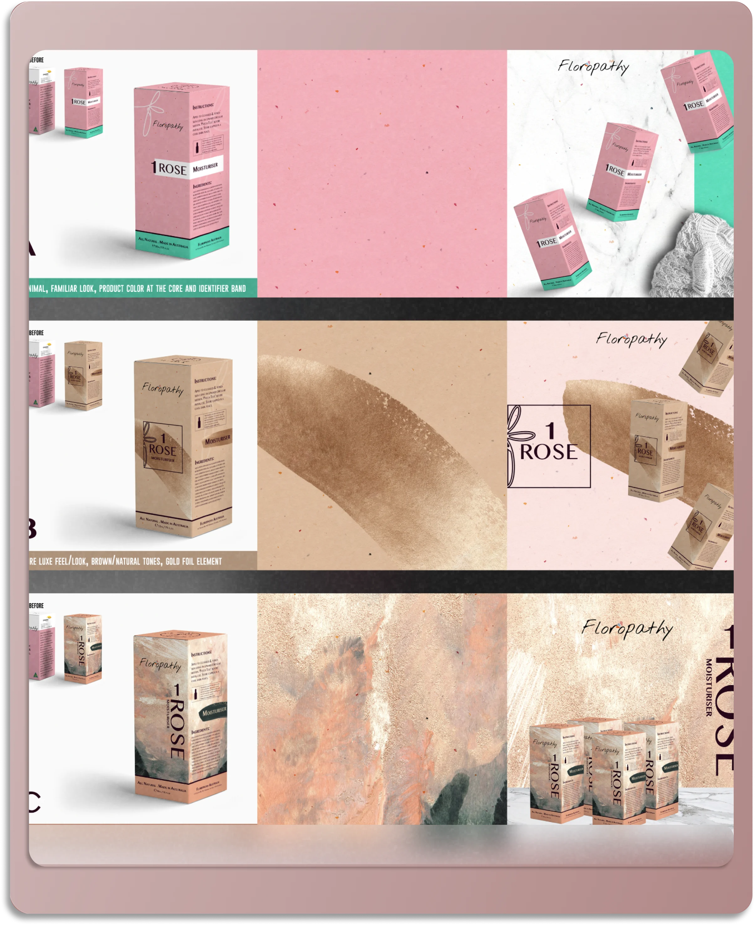
WPC was tasked with creating a packaging system and icon and logomark, that would maintain the brand’s core values of being floral, natural, and organic while also being adaptable for future growth.
Utilizing WPC’s Signature Visuals™ solution, we embarked on a redesign journey that would put the brand’s natural and organic ethos front and center. The new design had to be elegant yet simple, and capable of transcending cultural boundaries, as the client wanted to maintain the same packaging design across all their Asian markets.
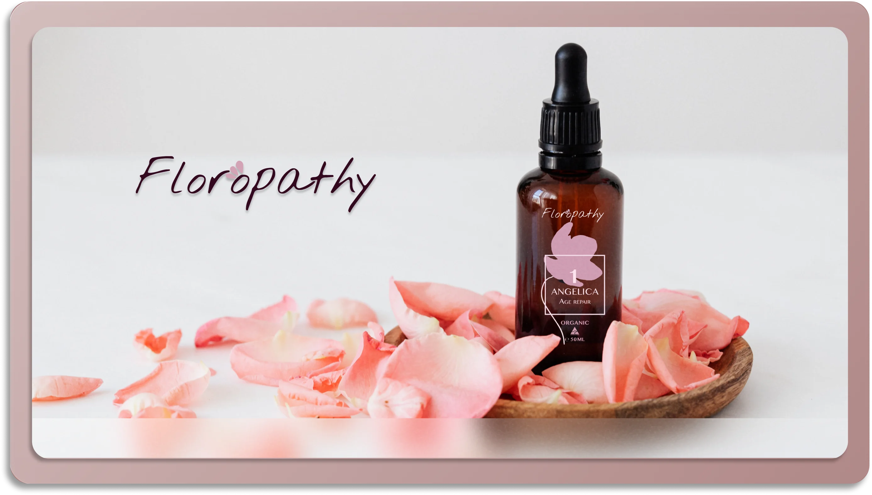
The new branding and packaging design was a harmonious blend of simplicity and elegance. The connection between floral, natural, and organic was emphasized throughout the design, from the bottle to the box. The challenge of creating a design that would translate across different cultures was addressed by focusing on universal elements that evoke the essence of nature and organic living.
WPC advised Floropathy to produce the packaging with natural, earth-tone colored paper with a light texture. This not only enhanced the natural and organic appeal of the brand but also aligned with the brand’s commitment to environmentally friendly practices. This strategic advice ensured that the brand’s natural DNA was consistently communicated across all touchpoints – from packaging and product to story and identity design.
key highlights
Results that Speak
The result was a compelling, culturally adaptable brand identity and packaging design that stayed true to Floropathy’s core values. The redesign not only elevated the brand’s visual appeal but also set the stage for Floropathy’s future growth and expansion into new product lines.
One of the key takeaways from the Floropathy project is the importance of maintaining brand consistency across different touchpoints. From the packaging to the product, from the brand story to the identity design, we made sure that Floropathy’s natural and organic DNA was consistently communicated. This not only strengthened the brand’s identity but also reinforced its core values in the minds of consumers. It’s a reminder that every aspect of a brand, no matter how small, plays a role in shaping its overall perception.
The Floropathy project highlighted the importance of future-proofing in brand and packaging design. As Floropathy planned for future product and line extensions, we created a packaging system that could easily accommodate these changes. This not only saved the client time and resources in the long run but also ensured a consistent brand experience for consumers, regardless of the product line they chose. This takeaway underscores the importance of strategic foresight in design, anticipating future needs and changes to ensure a brand’s longevity and adaptability.